7 Signs Your Website Needs a Redesign
Your website might be your best salesperson — or your silent business killer. Research shows that 88% of online visitors won’t return after a poor user experience. The problem? Most businesses don’t realize their website has become a liability until they start losing clients to competitors with modern, faster, better-designed sites.
A website isn’t a one-time investment you make and forget. It’s a living business tool that needs to evolve with technology, user expectations, and search engine requirements. What looked cutting-edge in 2023 can feel outdated by 2026 — and that perception directly affects your bottom line.
This article gives you 7 specific, data-backed warning signs that your website needs a redesign — plus a practical checklist for planning the project. No vague advice, just concrete metrics and actionable solutions.
Why Website Lifespan Matters
The average lifespan of a website design is 2-3 years. That’s not because designers get bored — it’s because the digital landscape shifts fundamentally within that timeframe. Browser capabilities change, screen sizes multiply, accessibility standards evolve, and user expectations rise with every new app and site they interact with daily.
Google’s Core Web Vitals and mobile-first indexing have turned website performance from a nice-to-have into a ranking factor. Sites that were technically fine three years ago may now fail Google’s performance benchmarks — invisibly bleeding search traffic every day.
Then there’s the competitive angle. Your industry peers are redesigning their sites. Every time a competitor launches a better website, your unchanged site looks worse by comparison. A redesign isn’t a luxury — it’s business maintenance, like updating your storefront or refreshing your product line.
The 7 Warning Signs
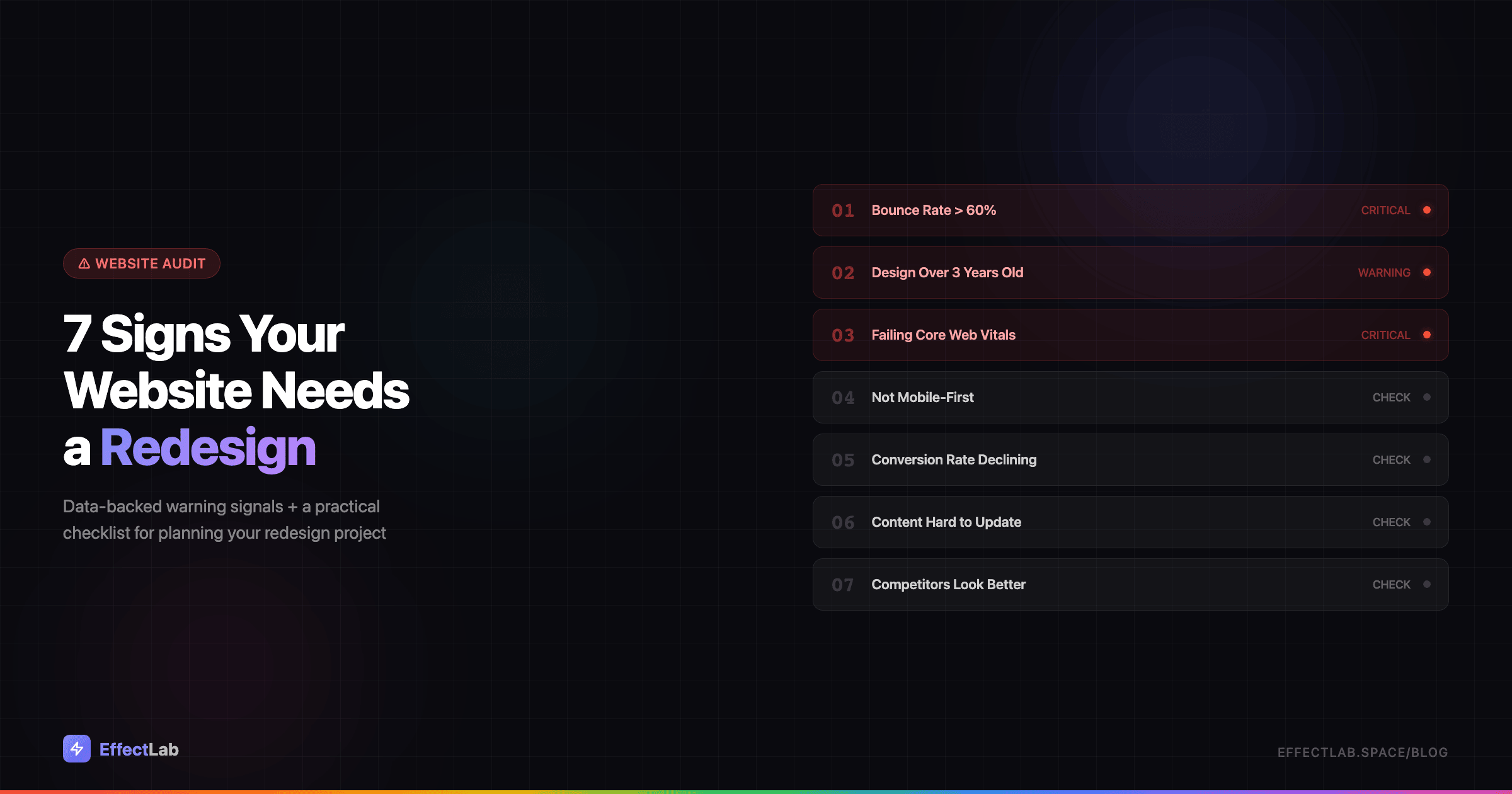
Not every website problem requires a full redesign. But when multiple warning signs appear together, they paint a clear picture: your site is holding your business back. Here are the seven signals that matter most.
1. Your Bounce Rate Exceeds 60%
Bounce rate — the percentage of visitors who leave without interacting — is one of the most telling metrics for website health. In GA4, look at the engagement rate (its inverse) for an even clearer picture.
What’s “normal” depends on your site type. Blog pages typically see 40-60% bounce rates. Landing pages should aim for 30-50%. E-commerce sites usually fall between 20-45%. If your numbers consistently exceed these benchmarks, something is fundamentally wrong with how visitors experience your site.
The most common culprits: slow page loading (users expect under 3 seconds), a dated design that erodes trust at first glance, poor mobile experience, or irrelevant content above the fold that doesn’t match what brought the visitor there. These are all common website mistakes that cost real money.
The fix: Conduct a UX audit focused on first impressions. Redesign your above-the-fold content to immediately communicate value. Optimize loading speed — every second of delay increases bounce rate by 32%.
2. Your Design Is More Than 3 Years Old
Web design trends in 2023 and 2026 are worlds apart. The flat design era has given way to bento grid layouts, micro-interactions, dark mode as standard, variable fonts, 3D elements, and AI-powered personalization. If your site still features hero sliders, stock photos of handshakes, and hamburger menus on desktop — it screams 2019.
This matters more than aesthetics. Stanford research found that 75% of users judge a company’s credibility based on its website design. A dated website doesn’t just look old — it makes your entire business feel outdated. Visitors unconsciously think: “If they can’t keep their website current, how current are their products and services?”
The fix: Do a visual audit. Open your site alongside your top 3 competitors. Compare navigation patterns, typography, color schemes, and content layouts. If the gap is visible, it’s time to update your visual identity. A strong brand design strategy starts with how your website looks and feels.
3. You’re Failing Core Web Vitals
Google’s Core Web Vitals are three specific metrics that measure real-world user experience: Largest Contentful Paint (LCP) should be under 2.5 seconds, Interaction to Next Paint (INP) should be under 200 milliseconds, and Cumulative Layout Shift (CLS) should be under 0.1. Since March 2024, INP replaced First Input Delay as the responsiveness metric — a much stricter benchmark.
These aren’t vanity metrics. Google uses Core Web Vitals as a ranking factor. Failing them means your site is literally being ranked lower than competitors with better performance. You can check your scores for free using Google PageSpeed Insights or the Core Web Vitals report in Google Search Console.
The fix: Start with image optimization — convert to WebP format, implement lazy loading, and serve properly sized images. Minify CSS and JavaScript, eliminate render-blocking resources, and consider a CDN for faster global delivery. For a comprehensive approach, check our guide on website promotion and technical SEO.
4. Your Site Isn’t Mobile-First
Over 60% of all web traffic now comes from mobile devices. Google has fully switched to mobile-first indexing, meaning it primarily uses the mobile version of your site for ranking and indexing. If your mobile experience is an afterthought, your entire SEO strategy is built on shaky ground.
Being “responsive” isn’t enough anymore. A truly mobile-first site is designed for small screens first and scaled up — not the other way around. Test yours honestly: Are buttons at least 44×44 pixels (Apple’s minimum tap target)? Is body text readable without zooming? Do forms work smoothly with mobile keyboards? Is there any horizontal scrolling? Can users complete key actions (contact, purchase, sign up) entirely on mobile without frustration?
The fix: Adopt a mobile-first redesign approach. Start wireframing on a 375px screen width and build up. Simplify navigation for touch interfaces, increase tap targets, and reduce form fields to the bare minimum. Every element should be designed for thumbs, not mouse cursors.
5. Your Conversion Rate Is Declining
Here’s the critical distinction: if your traffic is stable but conversions are dropping, the problem isn’t marketing — it’s your website. Your ads and SEO are doing their job bringing people in; your site is failing to convert them.
Average conversion rates vary by industry: landing pages typically convert at 2-5%, e-commerce at 1-3%, SaaS at 3-7%, and B2B lead generation at 2-5%. If you’re consistently below these benchmarks — or if your rate has declined over the past 6-12 months — your website’s UX is the bottleneck.
Common conversion killers include unclear calls-to-action, too many steps in the conversion funnel, lack of social proof, slow checkout processes, and forms that ask for too much information. Each of these is a design problem with a design solution. Our guide on high-conversion landing page elements covers the essential building blocks.
The fix: Audit your conversion funnel page by page. Use heatmaps and session recordings to see where users drop off. Redesign the weakest points — often the homepage hero, pricing page, or checkout flow. A/B test changes before committing to a full redesign.
6. Your Content Is Hard to Update
If adding a new page to your website takes hours instead of minutes, or if you need a developer for every text change, your site has a content management problem that will only get worse. This is often a sign of accumulated technical debt — outdated CMS versions, tangled custom code, or architectures that weren’t built to scale.
Red flags include: your site still runs on jQuery 1.x (or heaven forbid, has Flash elements), updating content requires FTP access and HTML editing, there’s no blog or news section because “it was too hard to add,” the admin panel crashes or times out regularly, and plugins or themes haven’t been updated in over a year (a security risk as much as a usability one).
The decision between no-code platforms and custom development is crucial here. A modern CMS like WordPress with a well-built theme gives you the best of both worlds: the flexibility of custom code with the ease of a visual editor for daily content updates.
The fix: Migrate to a modern, maintainable CMS. Adopt a component-based architecture where pages are built from reusable blocks. Ensure your team can update content, add pages, and publish blog posts without touching code.
7. Your Competitors Look Better
This one is subjective but powerful. Open your website in one browser tab and your top three competitors in three others. Switch between them. If the difference is immediately noticeable — if your site feels heavier, slower, less polished, or less professional — your potential customers are noticing too.
In B2B, this matters enormously. Research shows that 70% of the buyer’s journey happens online before a prospect ever contacts a salesperson. Your website is your first (and often only) chance to make an impression. If a competitor’s site looks more professional, loads faster, and communicates value more clearly, they’re winning deals before you even know you were competing.
The fix: Conduct a thorough competitive analysis. Document what competitors do better — navigation, visual design, content quality, page speed, mobile experience. Use this as your redesign brief. The goal isn’t to copy competitors, but to differentiate your brand while meeting or exceeding the baseline they’ve set.
Redesign vs Refresh: What Do You Actually Need?
Not every website problem demands a ground-up rebuild. The scope of your project should match the severity of the issues you’ve identified. Here’s a practical framework.
Visual refresh (1-2 warning signs): Update colors, typography, photography, and minor layout elements while keeping the overall structure intact. Timeline: 2-4 weeks. Budget: the most affordable option. Best when your site works well functionally but looks dated.
Partial redesign (3-4 warning signs): Redesign key pages (homepage, landing pages, contact), improve UX flows, optimize for mobile, and address performance issues. Timeline: 4-8 weeks. Budget: moderate. Best when specific parts of your site underperform while others work fine.
Full redesign (5+ warning signs): New visual design, potentially new CMS, rethought information architecture, content strategy overhaul, and complete technical rebuild. Timeline: 8-16 weeks. Budget: significant investment. Necessary when the site has fundamental structural problems that can’t be patched.
Count how many of the 7 signs apply to your site. That number tells you which level of intervention you need. Be honest — underestimating the scope leads to half-measures that waste budget without solving the core problems.
The Redesign Checklist
Once you’ve decided a redesign is necessary, these elements should be part of every project plan — regardless of scope.
Analytics audit. Document your current metrics as a baseline: traffic, bounce rate, conversion rate, page speed scores, top landing pages, and user flow patterns. You can’t measure improvement without knowing where you started.
Competitor analysis. Study 3-5 competitor websites. Document their strengths, weaknesses, and any features or patterns you want to adopt or improve upon.
UX research. Install heatmaps and session recording tools (Hotjar, Microsoft Clarity) at least 2-4 weeks before starting the redesign. Real user behavior data is infinitely more valuable than assumptions about what users want.
Mobile-first wireframes. Start every page design on mobile. If it works on a 375px screen, it will work everywhere. The reverse is almost never true.
Performance budget. Set hard targets before you start: LCP under 2.5 seconds, total page weight under 1MB, no more than 50 HTTP requests per page. These constraints should guide design and development decisions throughout the project.
SEO migration plan. This is where redesigns most commonly go wrong. Map every existing URL to its new equivalent. Set up 301 redirects for any URL that changes. Preserve title tags, meta descriptions, and heading structures. Monitor Google Search Console closely for 90 days post-launch to catch any indexing issues early.
Content strategy. A redesign is the perfect opportunity to audit your content. Identify pages that are outdated, underperforming, or redundant. Update, consolidate, or remove them. New design with old content is a missed opportunity. Once relaunched, driving traffic through a solid SMM strategy amplifies the impact of your redesign.
How EffectLab Handles Redesign Projects
Every redesign project at EffectLab starts with a deep audit — not a mood board. We analyze your current metrics, study your competitors, and identify the specific problems your redesign needs to solve. Design decisions are driven by data, not trends.
Our approach has delivered results across different industries and project types. For WohnArt Studio, a furniture assembly service in Berlin, we designed a clean, professional website that builds trust with transparent pricing and easy contact options. The OptiRent platform required building a full-featured e-commerce system for construction equipment rental and sales, serving 1,000+ clients. And for TechnoVector, we built a B2B catalog platform for a heavy equipment distributor with 140+ products from 11 international brands and an inquiry-based sales flow.
Whether you need a visual refresh or a complete rebuild, we build websites that are fast, mobile-first, and designed to convert. Get in touch to discuss your project — we’ll start with a free audit of your current site.
Conclusion
Your website doesn’t need to be perfect. But it does need to work for your business — not against it. If three or more of the warning signs above describe your site, the data is telling you something you can’t afford to ignore.
A redesign is an investment, not an expense. Every month you delay with a site that bounces visitors, fails on mobile, or looks worse than competitors is a month of lost revenue you’ll never recover. The best time to redesign was before the problems started. The second best time is now.
Start with the checklist above, count your warning signs, and decide your scope. And if you want expert guidance from day one — let’s talk about your redesign project.