Landing Page That Sells: 12 High-Conversion Elements
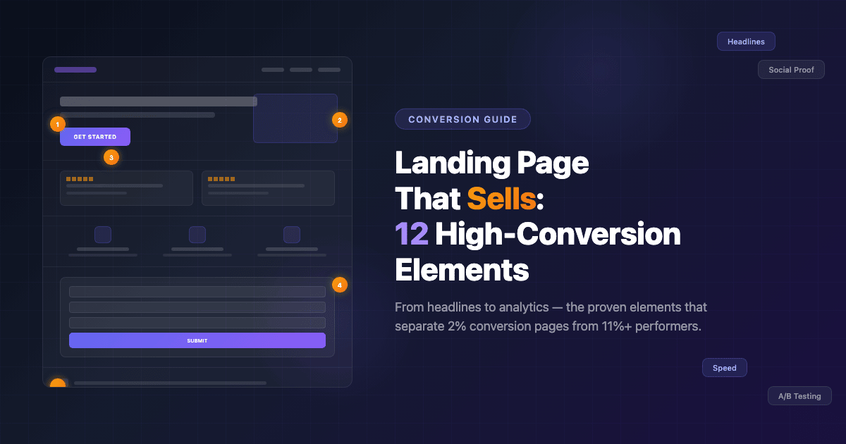
The average landing page converts at just 2.35%. The top 25% hit 5.31% or higher, and the best performers cross 11%. The difference between a mediocre landing page and a high-conversion landing page isn’t luck or budget — it’s structure. Specifically, it’s 12 elements that the highest-converting pages all share.
Whether you’re launching a product, collecting leads, or promoting a service, the fundamentals of a high-conversion landing page remain the same. This guide breaks down each element with practical advice you can apply today — no fluff, no theory-only abstractions. Just what works and why.
1. A Clear, Benefit-Driven Headline
Eight out of ten visitors read only the headline. If your headline doesn’t immediately communicate value, 80% of your traffic is gone before they scroll a single pixel.
The best-performing headlines follow a simple formula: [Result] + [Timeframe] + [Without Objection]. For example: “Grow Your Email List by 300% in 30 Days — Without Paid Ads.” This structure works because it promises a specific outcome, sets a realistic expectation, and preemptively removes the biggest objection.
Avoid vague headlines like “Welcome to Our Platform” or “The Best Solution for Your Business.” These say nothing. Your headline should answer one question: what will the visitor get? If you can’t explain the benefit in under 10 words, keep refining.
2. A Compelling Hero Section
The hero section is everything visible above the fold — before a visitor scrolls. It’s your first (and often only) chance to make an impression. A high-conversion hero section includes four components: a headline, a supporting subheadline, a primary CTA button, and a visual element (image, video, or illustration).
The subheadline expands on the headline’s promise with 1-2 sentences of specifics. The visual should reinforce the message — show the product in use, display a dashboard, or illustrate the result. Avoid generic stock photos that could appear on any website.
When we designed the hero section for the Zlata Consola project, every element served a purpose: a benefit-driven headline, a clear value proposition, and a CTA that directed visitors toward exactly one action. The result was a hero that communicated the full offer in under 5 seconds.
3. One Single Goal (One CTA)
The paradox of choice is a conversion killer. When a landing page offers multiple actions — “Buy Now,” “Learn More,” “Sign Up for Newsletter,” “Follow Us on Instagram” — visitors freeze. They don’t know what to do, so they do nothing.
A high-conversion landing page has one goal and one CTA repeated throughout the page. Every section, every piece of content, every visual element should guide visitors toward that single action. If your goal is lead generation, every CTA should lead to the form. If it’s a purchase, every CTA should point to checkout.
This doesn’t mean you can only have one button on the page. You can (and should) repeat the same CTA in multiple places — after the hero, after social proof, after the FAQ. But they should all lead to the same destination.
4. Social Proof That Feels Real
People trust other people more than they trust brands. Social proof — testimonials, reviews, case studies, client logos — reduces perceived risk and builds confidence. But here’s the key: it has to feel authentic.
Generic testimonials like “Great service! 5 stars!” convert poorly because they look fake (even when they’re real). The best social proof includes specifics: names, job titles, company names, measurable results. “EffectLab redesigned our site and our conversion rate increased 40% in the first month — Maria K., Marketing Director at TechCorp” is far more persuasive than an anonymous five-star rating.
If you’re just starting out and don’t have testimonials yet, use other forms of proof: the number of customers served, media mentions, certifications, or case studies with real results. Browse our portfolio for examples of how project results can serve as powerful social proof.
5. Visual Hierarchy and Scannable Layout
Visitors don’t read landing pages — they scan them. Eye-tracking studies consistently show that users follow an F-pattern (for text-heavy pages) or a Z-pattern (for visual pages). Understanding this behavior lets you place your most important elements exactly where eyes naturally go.
A strong visual hierarchy means the most important elements (headline, CTA, key benefits) are the most visually prominent. Use size, color, contrast, and whitespace to direct attention. Your CTA button should be the most visually distinct element on the page — a different color from everything else, large enough to be unmissable.
Break content into digestible chunks. Use short paragraphs (3-4 lines max), bullet points for lists, icons for features, and plenty of whitespace between sections. A cluttered page overwhelms visitors; a clean, scannable layout guides them effortlessly toward your CTA.
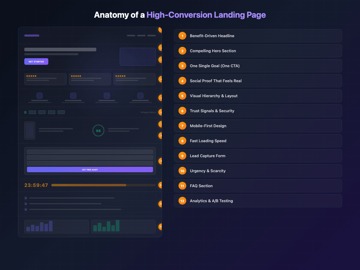
6. Trust Signals and Security Indicators
Before visitors hand over their email address or credit card, they need to trust you. Trust signals reduce anxiety and remove the “is this safe?” barrier that kills conversions.
Essential trust signals include: SSL certificate (the padlock icon), payment security badges (Visa, Mastercard, PayPal logos), a visible privacy policy link, a physical business address, and a professional-looking design. Yes, design quality itself is a trust signal — a site that looks outdated or broken triggers immediate distrust.
For service businesses, also include: years of experience, number of completed projects, industry certifications, and clear contact information. Hiding your phone number or address makes visitors suspicious. Many of the common website mistakes that cost businesses money involve neglecting these basic trust indicators — small oversights that create big conversion barriers.
7. Mobile-First Design
Over 62% of web traffic now comes from mobile devices, and for many industries, it’s even higher. If your landing page doesn’t look and work perfectly on a phone screen, you’re losing the majority of your potential customers.
Mobile-first design means more than just making elements smaller. It requires rethinking the layout entirely: single-column structure, larger tap targets (minimum 44×44 pixels), thumb-friendly CTA button placement, and simplified navigation. Forms should be shorter on mobile, images should be optimized for smaller screens, and text should remain readable without zooming.
Test your landing page on actual devices, not just browser simulators. What looks fine in Chrome DevTools often has subtle issues on real phones — buttons too close together, forms that are hard to fill out, or images that load slowly on 4G connections. As we discussed in our article on website mistakes, ignoring mobile experience is one of the fastest ways to hemorrhage conversions.
8. Fast Loading Speed
Every additional second of load time reduces conversions by approximately 7%. A page that takes 5 seconds to load instead of 2 has already lost over 20% of potential conversions before visitors even see your content.
The speed fundamentals: compress and properly size all images (WebP format is now the standard), minimize CSS and JavaScript, leverage browser caching, and use a CDN. Remove any third-party scripts that aren’t absolutely essential — each tracking pixel, chat widget, or social embed adds weight.
Target a Largest Contentful Paint (LCP) of under 2.5 seconds and a Cumulative Layout Shift (CLS) of under 0.1. These Core Web Vitals directly impact both user experience and Google rankings. For a deeper dive into performance optimization and how it affects your search visibility, check out our guide on website promotion in 2026.
9. A Lead Capture Form That Doesn’t Scare Away
If your landing page’s goal is lead generation, the form is where the conversion either happens or dies. And the number one form killer is asking for too much information.
Research consistently shows that 3 fields is the sweet spot: name, email, and one qualifying question (like company size or project type). Every additional field you add reduces completion rates by roughly 10%. That “phone number” field you think is essential? It’s costing you leads. Collect it later, after the initial conversion.
Form design matters too. Use clear field labels (not just placeholders that disappear when clicked), show a progress indicator for multi-step forms, and make the submit button text specific. “Get My Free Audit” converts better than “Submit” because it reminds visitors what they’re getting in return.
10. Urgency and Scarcity (Without Being Sleazy)
Urgency and scarcity are powerful psychological triggers — but only when they’re honest. “Only 3 spots left this month” works if you genuinely limit your client intake. “Offer expires in 24 hours” works if the price actually goes up tomorrow. Fake countdown timers that reset on page refresh? Those destroy trust instantly.
Effective urgency tactics: limited-time bonuses (a free strategy call for sign-ups this week), seasonal pricing (year-end discount that genuinely ends December 31), or capacity-based limits (we take only 5 new projects per month). The key is that the constraint must be real and verifiable.
If you don’t have a genuine reason for urgency, don’t fabricate one. Instead, focus on the cost of inaction: “Every day without a converting landing page is a day of lost revenue.” This creates urgency without deception.
11. FAQ Section That Handles Objections
Every visitor has objections. “Is this worth the price?” “What if it doesn’t work for my industry?” “How long will it take?” A well-crafted FAQ section doesn’t just answer questions — it systematically dismantles every reason someone might have for not converting.
Write your FAQs by listing every objection your sales team hears, every concern from support tickets, and every question prospects ask before buying. Then answer each one directly, honestly, and concisely. Don’t hide behind corporate language — address the real concern.
Bonus: FAQ sections are excellent for SEO. They naturally target long-tail search queries, and when marked up with FAQ schema, they can appear as rich snippets in Google search results — giving your page more visibility and higher click-through rates.
12. Analytics and A/B Testing Setup
A landing page is never “done.” The highest-converting pages are the result of continuous testing and optimization. Without analytics and A/B testing, you’re guessing — and guessing is expensive.
At a minimum, set up: Google Analytics 4 for traffic and conversion tracking, a heatmap tool (Hotjar or Microsoft Clarity — both have free tiers) to see where visitors click, scroll, and drop off, and an A/B testing framework to systematically test changes.
Start with high-impact tests: headline variations, CTA button color and text, hero section layout, and form length. Test one variable at a time, run each test until you reach statistical significance, and document your results. Over time, these incremental improvements compound. A 10% improvement in headline performance plus a 15% improvement in CTA plus a 20% improvement in form completion — that’s a dramatically different landing page. Making the right technology choices from the start is key — our comparison of no-code vs custom development can help you pick the right foundation for testing and iteration.
Putting It All Together
A high-conversion landing page isn’t built by nailing one element — it’s built by getting all 12 right. The headline hooks attention. The hero section communicates value. A single CTA provides clarity. Social proof builds trust. Visual hierarchy guides the eye. Trust signals remove anxiety. Mobile design captures the majority. Speed prevents abandonment. Smart forms capture leads. Honest urgency motivates action. FAQs handle objections. And analytics ensure continuous improvement.
You don’t need to implement all 12 at once. Start with your weakest points — if your page loads in 6 seconds, fix speed first. If your form has 8 fields, cut it to 3. Each improvement moves the needle, and the cumulative effect is transformational.
Need a landing page that actually converts? EffectLab builds high-performance landing pages with all 12 elements baked in — designed, developed, and launched in as little as 2 weeks. Get in touch for a free consultation and let’s build a page that turns visitors into customers.